In an era of digital precision, why are so many photographers chasing the imperfections of the past? The answer lies in emotion. The subtle grain, rich tonal shifts, and gentle fade of classic film stocks evoke a sense of nostalgia, texture, and timelessness that digital images, in their pristine state, can lack.
While presets are a fantastic starting point, understanding how to manually shape these qualities in Adobe Lightroom is the secret to true artistic control. This guide will walk you through the key tools for crafting your own authentic film looks, from nuanced colour grading to the art of applying digital grain.
Part 1: Crafting the Film Tones – The Colour Foundation
Before you even think about adding grain, you must first build the tonal foundation. Grain added to a sterile, digital-looking image will feel out of place. The goal is to first convince the eye that the light and colour are from a filmic world.
The Most Powerful Tool: The Tone Curve
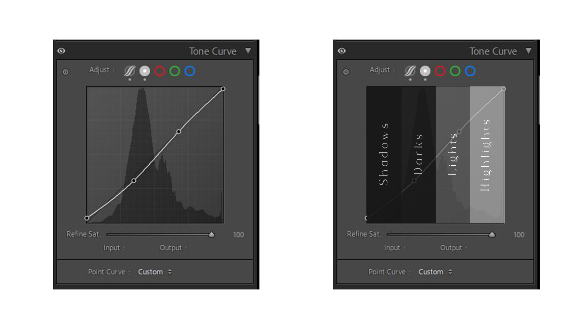
If you learn only one tool in this guide, make it the Tone Curve. This panel gives you precise control over the brightness and contrast of your image.
Creating the “Matte” or Faded Look: The signature look of many film stocks is that the blacks are not pure black; they are slightly lifted and faded.
Go to the Tone Curve panel and ensure you are on the “Point Curve” (the icon with the small dot and curve).
Grab the bottom-left point on the curve, which represents the darkest shadows in your image.
Drag this point straight up. Watch your image’s darkest areas lift into a soft grey. A little goes a long way.
Adding Soft Contrast: A gentle “S-curve” adds contrast in a pleasing, non-digital way.
Click to add a point in the lower-middle of the curve (the shadows) and drag it down slightly.
Click to add a point in the upper-middle of the curve (the highlights) and drag it up slightly. This combination creates soft, rich contrast that complements the faded blacks.
Example S Curve | The Tone Curve
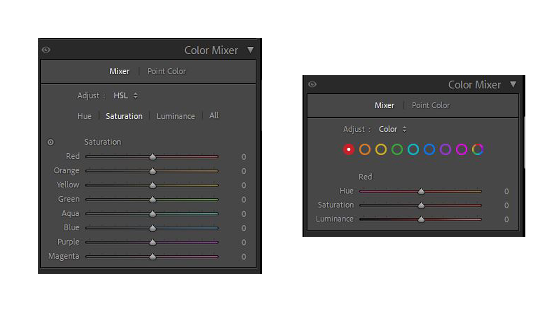
Shaping Colour: The HSL & Colour Grading Panels
This is where you infuse the image with the specific colour palette of a film stock.
HSL/Colour Panel (Hue, Saturation, Luminance): This panel lets you target and alter specific colours.
To Emulate Fuji Stocks (e.g., Pro 400H): Fuji is known for its beautiful handling of greens. Try shifting the Green Hue slightly towards cyan/blue and the Yellow Hue slightly towards green. Often, desaturating the greens and yellows slightly also contributes to this look.
To Emulate Kodak Stocks (e.g., Portra): Kodak is famous for its warm, lifelike skin tones. Try subtly shifting the Red and Orange Hues towards each other and slightly increasing their Luminance (brightness) to make skin glow.
Colour Grading Panel (formerly Split Toning): This tool adds a specific colour tint to the shadows, midtones, and highlights. It’s perfect for adding mood.
A classic film look often involves adding a cool tone to the shadows. Select the “Shadows” wheel and gently push the colour point towards a teal or blue. Keep the saturation very low.
You can then balance this by adding a complementary warm tone (like a subtle orange) to the “Highlights” wheel. This “teal and orange” look is popular for a reason—it creates a beautiful and cinematic colour contrast.
The HSL/Colour Panels
Example Settings for Iconic Wedding Looks
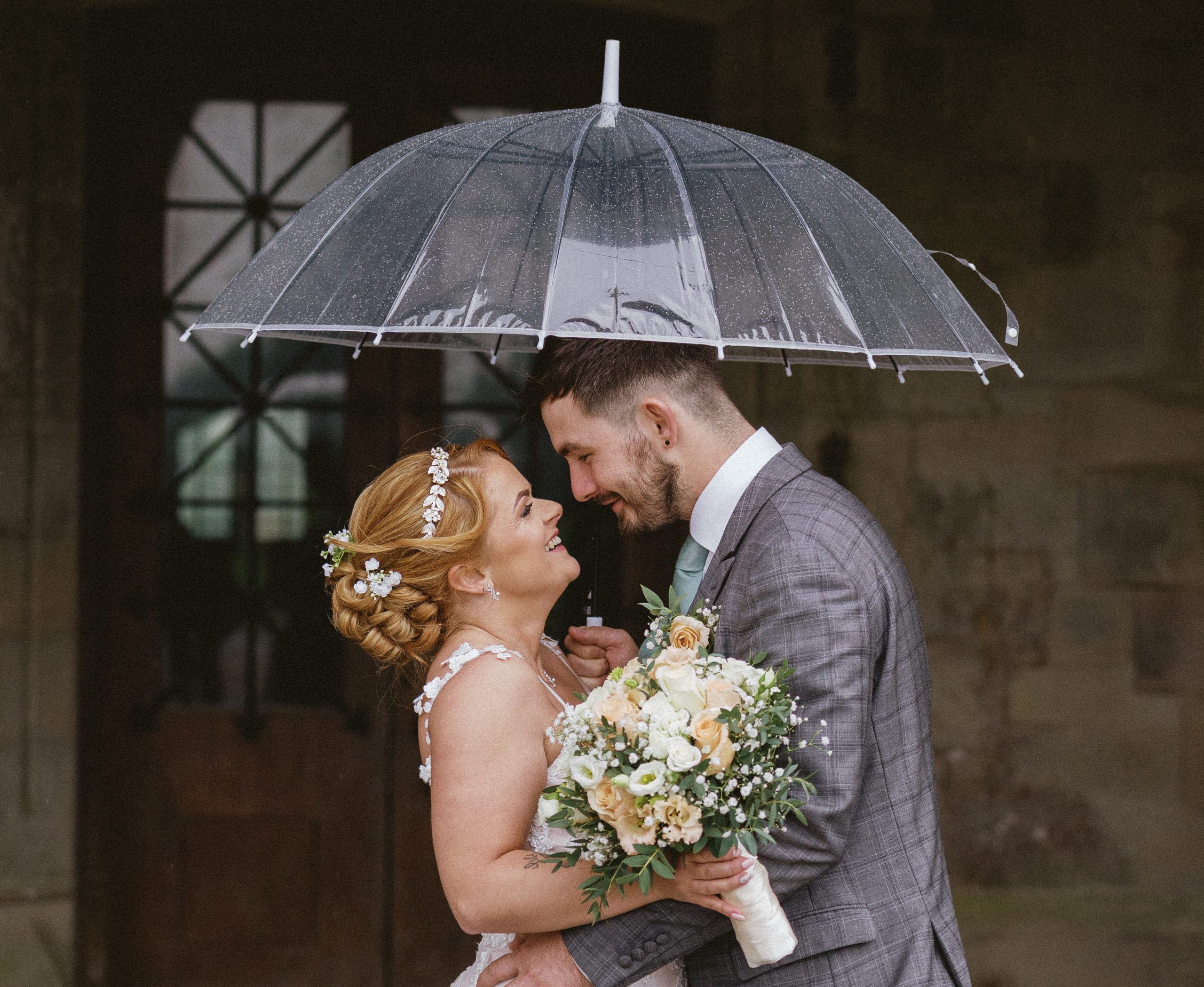
The Kodak Portra 400 Look (Warm, Glowing & Romantic):
Ideal for golden hour portraits and capturing warm, intimate moments. It’s celebrated for its incredible skin tone reproduction.
Tone Curve: A gentle “S” curve with the blacks significantly lifted. In the Blue channel, pull the shadows down slightly to add yellow into the blacks.
HSL/Colour:
Hue: Shift Greens towards yellow (+15).
Saturation: Slightly desaturate Blues (-15). Boost Oranges slightly (+5 to +10).
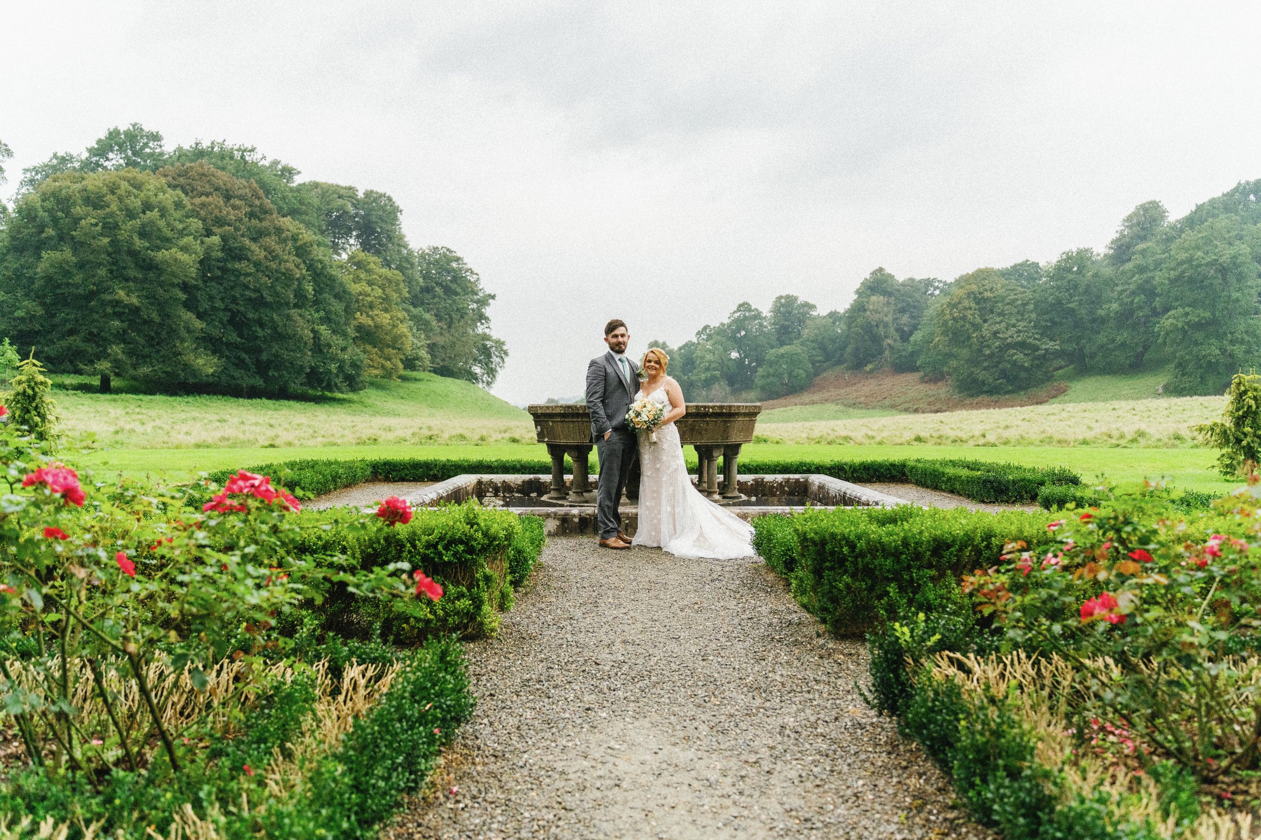
Perfect for bridal portraits, flat lays, and creating an overall bright and clean aesthetic with a hint of minty green.
Tone Curve: A less aggressive “S” curve. Focus on lifting the midtones for that airy feel.
HSL/Colour:
Hue: Shift Greens towards Aqua (+20). Shift Yellows towards Green (+10).
Saturation: Desaturate Greens (-20) and Yellows (-10).
Colour Grading:Shadows: Cyan/Green (Hue ~160, Saturation 10). Highlights: Keep neutral or add a touch of warmth.
Grain: Amount 10, Size 25, Roughness 45.
Fuji Pro 400H Example
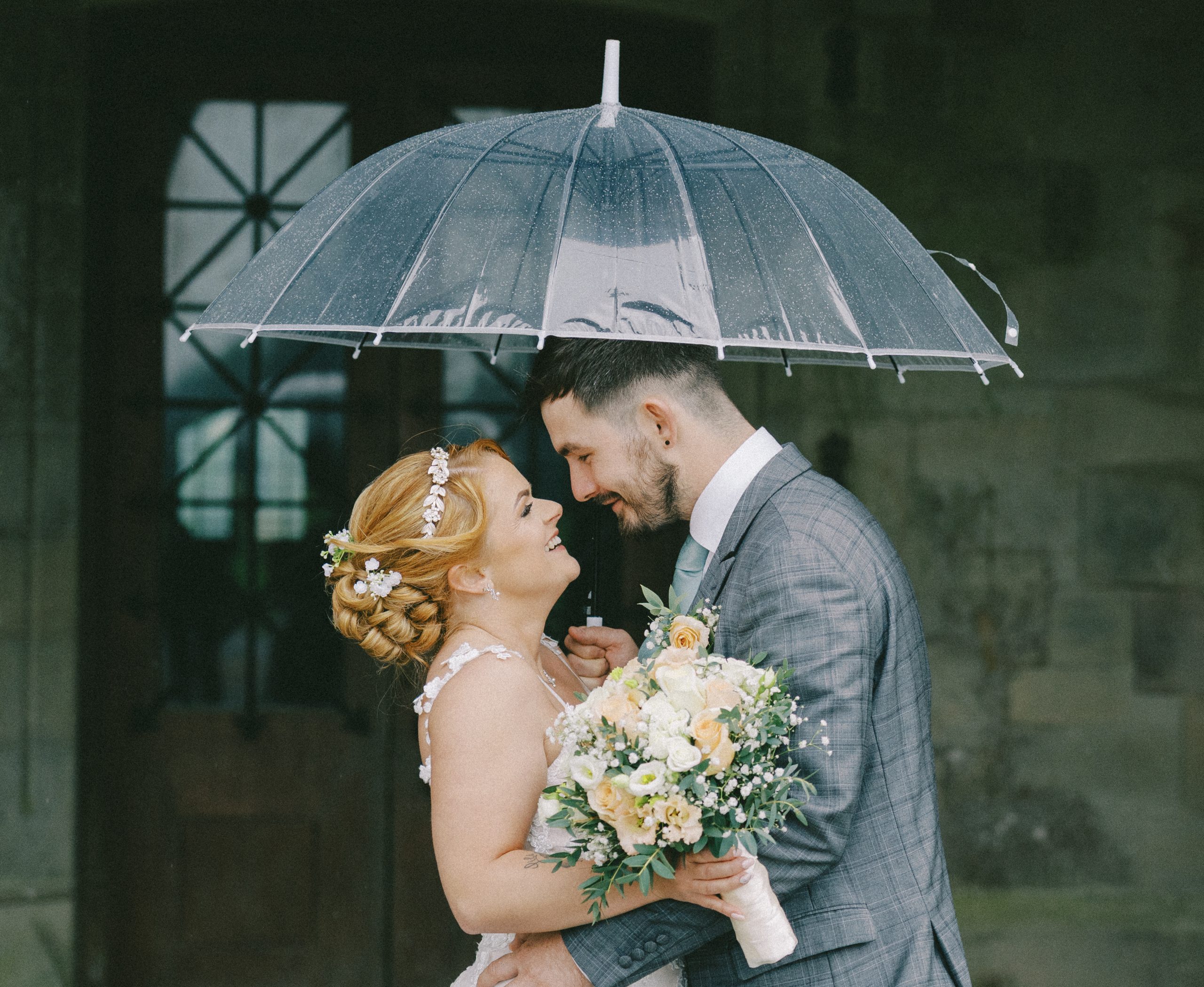
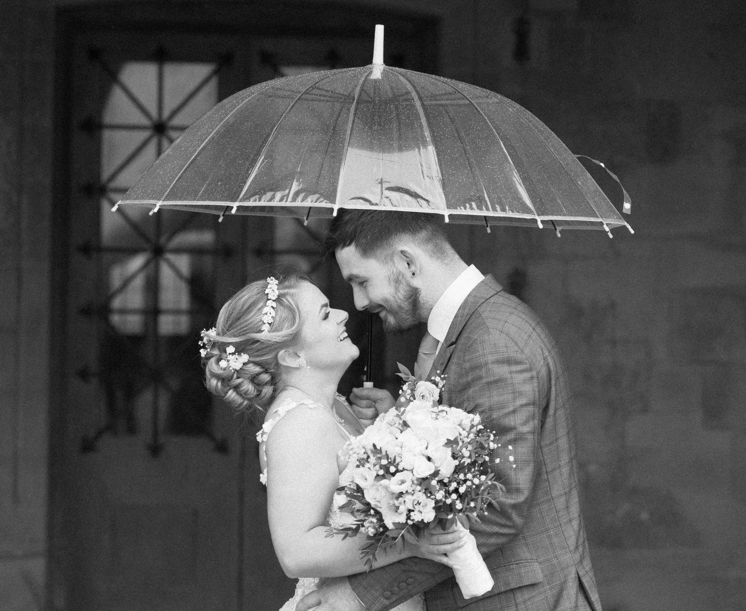
The Classic B&W Look (Ilford HP5):
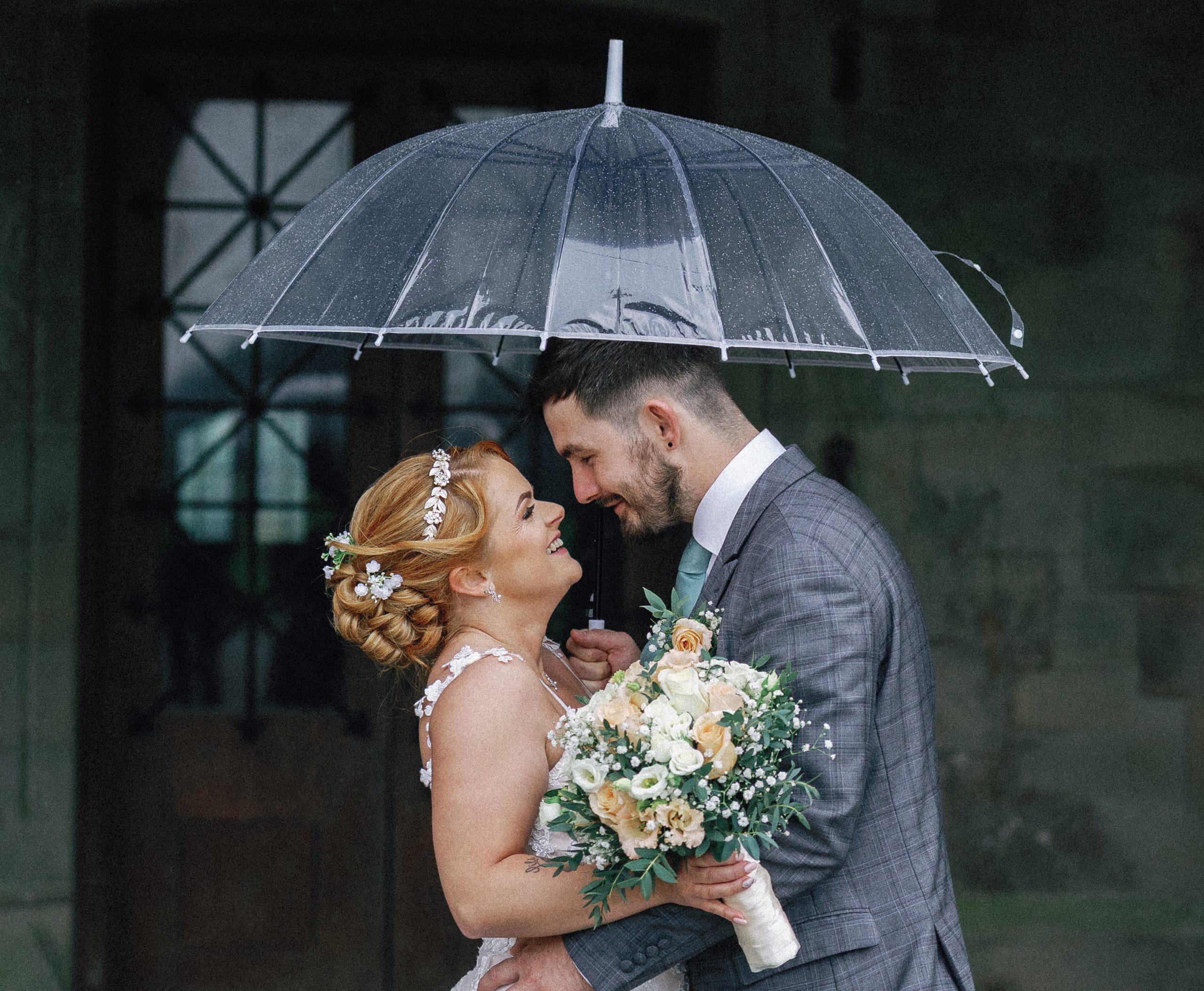
For those powerful, emotional moments—the first look, the exchange of rings, the final dance. A punchy, characterful black and white is a must.
B&W Mixer: Convert to Black & White. This is your key tool. For stunning portraits, boost the Red and Orange sliders to make skin shine. For a dramatic sky in an outdoor shot, pull the Blue slider down.
Tone Curve: Create a strong “S” curve for good contrast, but keep the blacks lifted for that soft, matte finish.
Grain: Don’t be shy. A classic B&W can handle it. Try: Amount 30, Size 35, Roughness 60.
Ilford HP5 Example
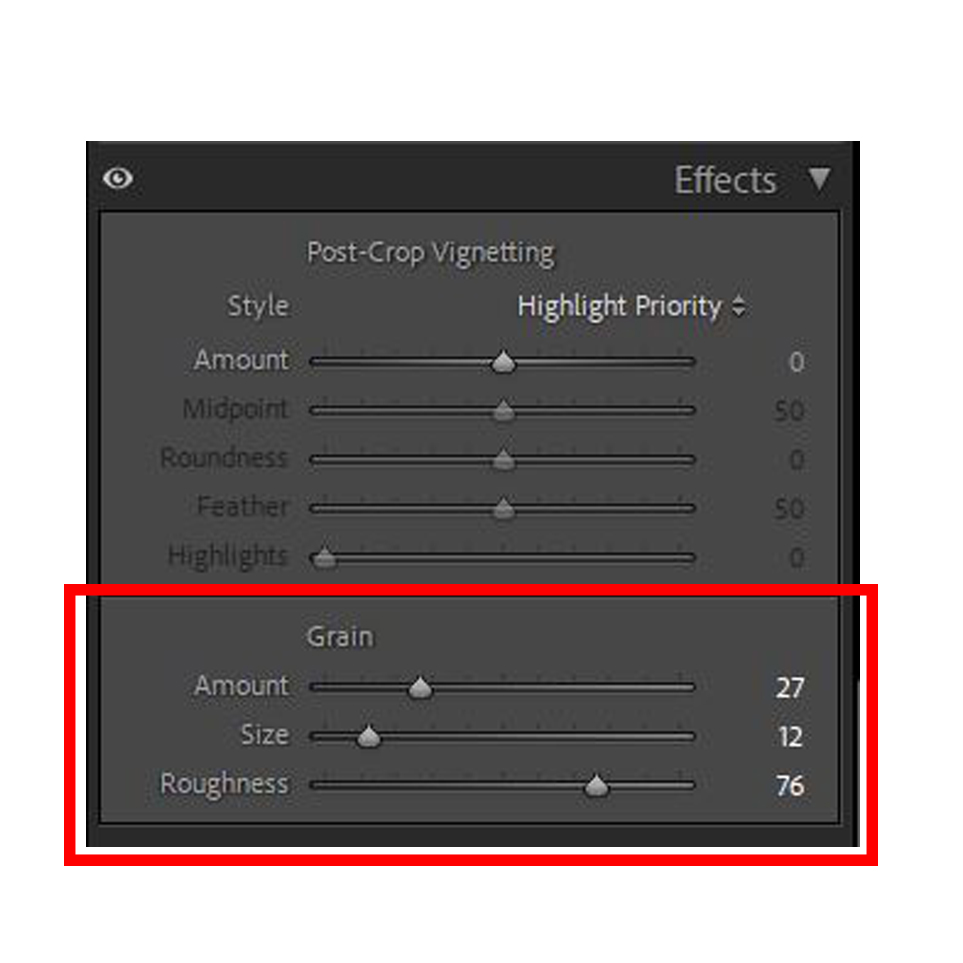
Part 2: The Art of Digital Grain
Once your tones feel right, it’s time to add the texture. The “Grain” section is located within the Effects panel in Lightroom. It has three simple but powerful sliders.
The Grain Panel
Amount: This controls the overall intensity of the grain.
How to Use It: Always start low (around 10-15) and slowly increase it. The goal is for the grain to be felt more than it is seen. Overdoing the Amount is the fastest way to make an image look fake.
Size: This controls how large or fine the grain particles are.
How to Use It: Think of this like film speed (ISO). A low-ISO film like Kodak Ektar 100 has very fine, almost unnoticeable grain. To emulate this, use a small Size (e.g., 25). A high-speed film like Ilford Delta 3200 has much larger, coarser grain. To emulate this, use a larger Size (e.g., 50-60).
Roughness: This controls the uniformity of the grain pattern.
How to Use It: Lowering the Roughness makes the grain very even and uniform, almost like a digital pattern. Increasing it makes the grain more chaotic, random, and organic—which generally looks more authentic to real film. A setting between 50 and 70 is often a good starting point.
Best Practices for Grain:
Zoom to 100%: Always zoom in to a 1:1 view to judge the effect of your grain accurately. What looks subtle when zoomed out might be overwhelming up close.
Less is More: The most convincing use of grain is subtle. It should add texture and depth without distracting from the subject.
Consider the Context: A dark, moody, black-and-white image can handle much more grain than a bright, airy, high-key bridal portrait. Let the mood of the image dictate the amount of grain.
By learning to shape the tones first and then applying grain as a final textural element, you move from simply applying a look to truly understanding and crafting it. This process is the key to developing a style that is both timeless and uniquely your own.
Grain - Amount: 37 | Size: 12 | Roughness: 76
Grain - Amount: 20 | Size: 11 | Roughness: 68
Consistency is Key: Creating Your Wedding Presets
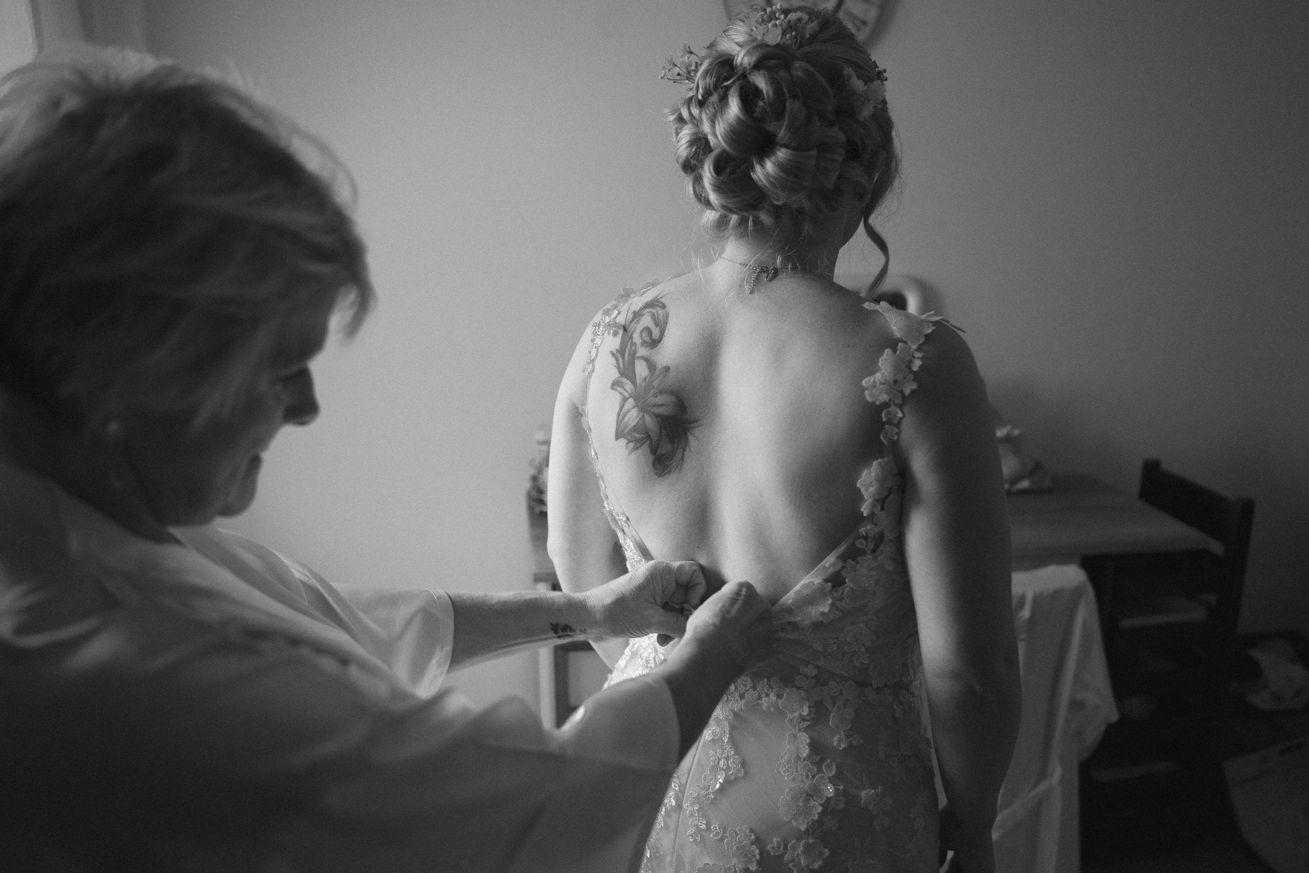
Editing hundreds, if not thousands, of photos from a single wedding demands consistency. Once you’ve crafted an edit you love on a representative image (one with good light and skin tones), save it as a preset.
In the Presets panel, click the ‘+’ icon and select ‘Create Preset’. Name it something descriptive (e.g., “Signature Wedding – Portra Warmth”). This allows you to apply a consistent base edit to your entire gallery with one click. From there, you can make minor tweaks to exposure and white balance on individual images, dramatically speeding up your workflow while ensuring a cohesive, professional final product for your clients.
By moving beyond generic filters and manually crafting your look, you infuse your work with a piece of your own artistry. You deliver a gallery that is not only beautiful but also deeply emotive, turning your clients’ wedding photos into the timeless heirlooms they deserve to be.